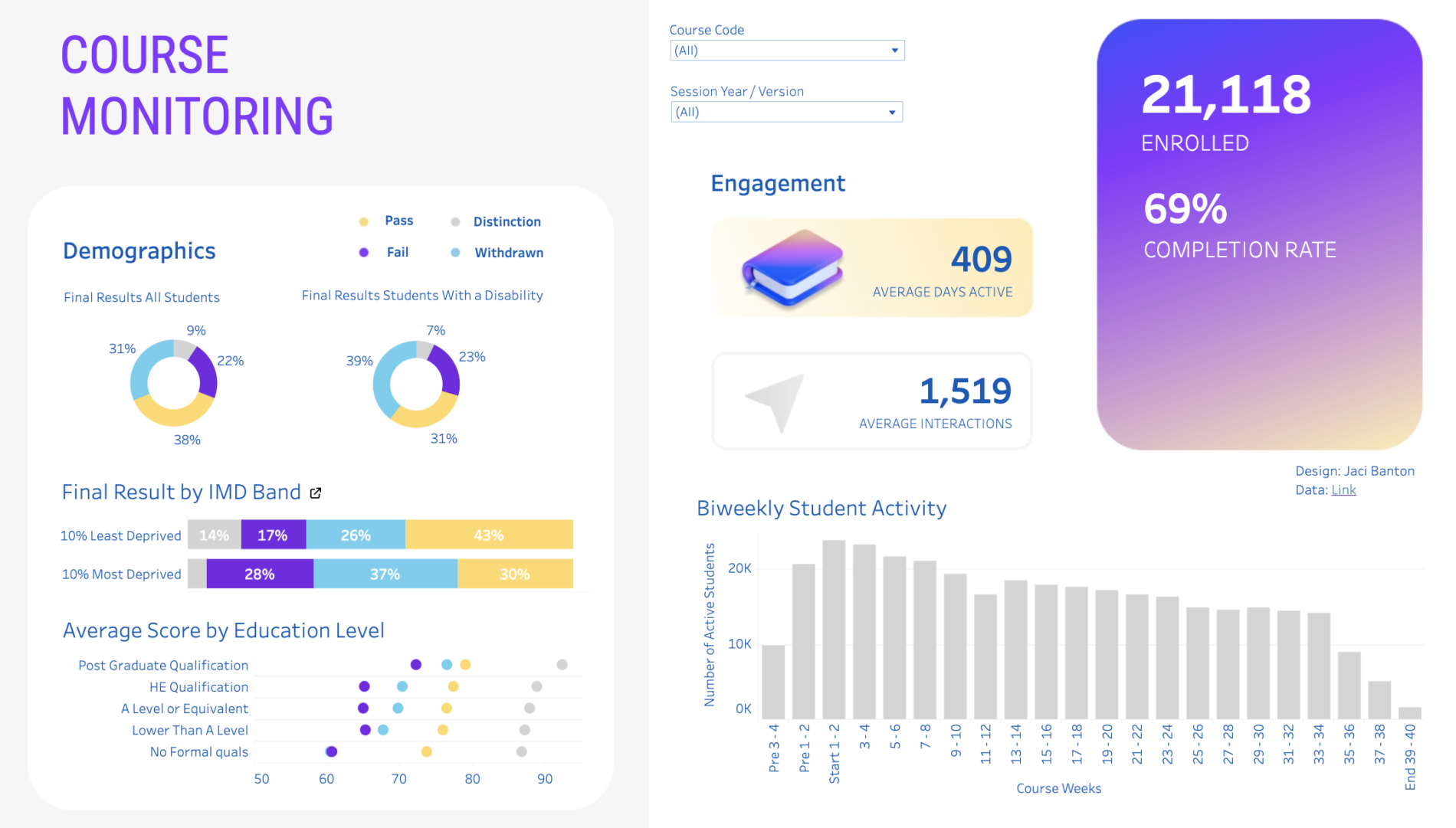
Creating this dashboard was the final step in my Online Courses personal project.
Through the process of creating the dashboard I learned:
-
how to create advanced charts,
functions for calculated fields,
how to work with levels of detail,
how to implement a custom design.
Prior to this step:
Step 1: I performed an exploratory data analysis (linked here) on the Open University Learning Analytics Dataset (OULAD) using Python in order to understand the quality, composition and results of the data,
Step 2: then I installed a SQL server and using Python, I programmatically imported the final dataset,
Step 3: I then used SQL to test the feasibility of various online course monitoring indicators (linked here).
Through my research and feasibility testing in SQL, I shortlisted several indicators that are popular in the online learning sector for monitoring online courses.
Dashboard Plan:
| Indicator Category | Indicator |
|---|---|
| Overview | # Enrolled |
| Competence | Final results by all students and those with a disability |
| Competence | Final results by lowest and highest deprivation band |
| Competence | Top 5 most difficult assessments |
| Competence | Correlation between level of education and final score |
| Course Performance | Completion rate |
| Course Performance | Time to completion |
| Engagement | # Active students biweekly |
| Engagement | Consumption rate |
| Engagement | Average number of interactions with course materials |
| Engagement | Average number of times each student accesses the platform |
I intended to filter all components in the dashboard by course. Unfortunately Tableau public doesn’t allow full data blending. This meant that some indicators that were comprised of data from three connected tables weren’t filterable, because the filter couldn’t access the necessary column.
Because of this paywall I had to exclude some indicators, so I want to illustrate them here.
Consumption Rate
Consumption Rate (also called usage rate) is an early in the course indicator of how engaged students are. If the rate is higher it indicates students are consuming the course content faster.
I calculated this indicator based on the number of submitted assessments within 30 days from course start in proportion with the total possible assessments to be submitted.
The following calculated field determines the percent of assessments submitted before 31 days.
SUM(IIF([Date Submitted] <= 30, 1, 0)) / COUNT([Id Assessment])
Time to Completion
Time to Completion is a measure of how fast it takes most students to complete a course. This can then be judged in context of the intended course length. Courses taking much longer than estimated may indicate that the content is too arduous and conversely, faster than expected completion may be too easy or lack depth, causing boredom.
To calculate this at the correct level of detail it’s first necessary to create a calculated field using the FiXED function in order to aggregate on the last date a student submitted an assessment (e.g an exam). It’s then possible to create an average from this field in the Marks pane.
{ FIXED [Id Student] : MAX([Date Submitted]) }
Online Course Dashboard
Inspired by my background as an educator, I wanted to challenge myself to create a Tableau dashboard for course administrators. The dashboard would allow the course administrator to monitor registration, demographics, final results and engagement.
View Python Analysis View SQL Indicator Exploration View Live Dashboard